Gradebook analysis with R - Part III
This is Part III in Scout from University of California’s three-part series, Gradebook analysis with R. If you missed Part I or Part II, click here for Part I and here for Part II
![]()
In Parts I and II we showed how to clean, tidy, explore and plot your gradebook data. Now it’s time to show off some of that work and turn your findings into shareable data products. Data analysis is, after all, a communal activity, and there’s no sense in hogging all that insight to yourself. Sharing is caring.
Towards that end, we’ll explain how to share your data in a variety of ways and formats. If there’s a single takeaway from this post, it’s that there are tools and resources in R to create almost any presentation imaginable.
Sharing Image Files
In the event that you do find a plot worth sharing, you can save any ggplot2 plot to an image file with the ggsave() function. The file will be saved to your current working directory.
#After creating a ggplot object:
ggsave(file = "final_exam_histogram.png")
#Or, create a ggplot object and pass it to ggsave():
plot1 <- ggplot(plot_data, aes(Final)) + geom_histogram()
ggsave("final_exam_histogram.png", plot1)
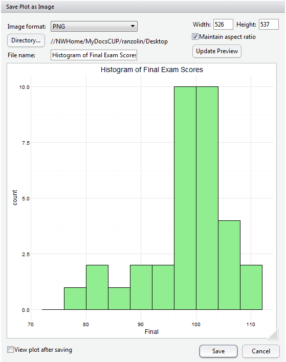
And if you’re creating plots in base R, you can also use the respective png(), jpg(), or pdf() functions. Alternatively, if you’re working in the integrated development environment (IDE–software applications that provide a variety of tools for programmers) RStudio , you can also just export the plot to an image file from within the interface. This is handy not only because it saves you from writing additional code, but because you can resize the image to any desired specifications while maintaining its aspect ratio:
Sharing CSV or Spreadsheet Files
A colleague may also request a spreadsheet of your tidied data, and you can create a CSV or Excel Workbook with write.csv() or write.xlsx() from the xlsx package. Again, the file will be saved to your current working directory.
write.csv(apcalcbc, file = "apcalcbc.csv") #The first argument is the name of the R object
library(xlsx)
write.xlsx(apcalcbc, file = "apcalcbc.xlsx", sheetName = "AP Calculus BC")
If you’re working with data from Google Sheets, we highly recommend the googlesheets() package which allows you to access, extract, edit, create, delete or copy data from your Google Drive. The documentation on GitHub is fantastic and gets you up and running in no time.
Sharing With R Markdown and RPubs
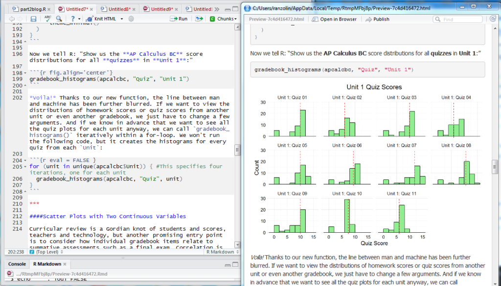
Authoring scripts in R Markdown allow you to create dynamic documents, presentations and reports. If you’re familiar with markdown syntax, picking up R Markdown will be a cinch. But even if you’ve never written a line of markdown, the conventions are easy to follow with a cheat sheet nearby. Along with its reproducibility, one of the main advantages of R Markdown scripts is how neatly and orderly it renders plots, blocks of code, tables and images. This entire series, for example, was authored in R Markdown and “knit” to HTML files with the knitr package. In the image below, the left pane shows my R Markdown script from Part II, and the right pane shows some of the rendered HTML output.
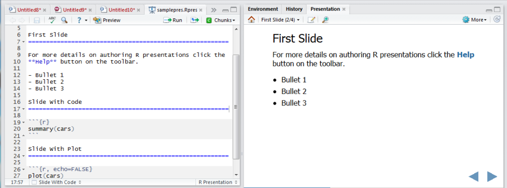
With a little twist, you can also create HTML5 slides with R Presentations within RStudio:
Finally, you can publish all of your R Markdown documents to RPubs, a free web publishing site if you so desire. All you need is an account.
Sharing Shiny Apps
Disclaimer: Shiny apps are relatively easy to create, but require a measure of patience, forethought and attention to detail. In brief, Shiny allows you to create interactive web applications with zero knowledge of HTML, CSS or JavaScript. The possibilities are endless, but you would be wise to visit with whomever you intend to showcase your data in advance. What precisely do they need to see? In the context of student performance and gradebooks, what data stimulates substantive discussion, or stirs imaginative thinking? Is the purpose to showcase student performance or evaluate the curriculum? Without clear direction, Shiny app development tends to wander.
The available Shiny documentation is superb, and we highly recommend working through RStudio’s Shiny tutorials. Their gallery of Shiny apps is also a fountain of inspiration.
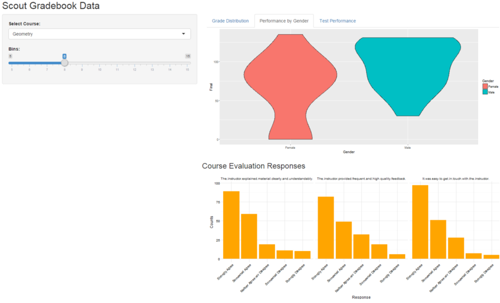
In the example below, we created a Shiny app that integrates data from our LMS, SIS and course evaluations. The app responds to user input: it will rerun when a different course is selected, or when the number of histogram bins is adjusted. The user can check the overall grade distribution on the “Grade Distribution” tab, view student performance by gender on the “Performance by Gender” tab, and isolate test performance on the “Test Performance” tab. The bar plots on the bottom show student responses to the course evaluation. Thus, with just a few clicks, users can get a sense of both student performance and student appreciation.
Screenshot of the Shiny App:
Here is the code for this particular app (Note: evaluations and gradebooks are objects in my environment):
library(shiny)
ui <- fluidPage(
titlePanel("Scout Gradebook Data"),
sidebarLayout(
sidebarPanel(
selectInput("course", "Select Course:", choices = c("Geometry", "AP Calculus BC"), selected = "Geometry"),
sliderInput("slider", "Bins:", min = 5, max = 15, value = 8, step = 1)
),
mainPanel(
fluidRow(
column(width = 9,
tabsetPanel(
tabPanel("Grade Distribution", plotOutput("histogram")),
tabPanel("Performance by Gender", plotOutput("violins")),
tabPanel("Test Performance", dataTableOutput("tests"))
)
)
),
fluidRow(h3("Course Evaluation Responses"),
column(width = 9,
plotOutput("evaluations")
)
)
)
)
)
server <- function(input, output) {
gradebook <- reactive({
gradebooks %>%
filter(Course == input$course)
})
output$histogram <- renderPlot({
ggplot(gradebook(), aes(Grade)) +
geom_histogram(bins = input$slider, fill = "lightblue", color = "black") +
theme_minimal()
})
output$violins <- renderPlot({
plot_data <- gradebook() %>%
distinct(Student)
ggplot(plot_data, aes(Gender, Final, fill = Gender)) +
geom_violin()
})
output$tests <- renderDataTable({
gradebook() %>%
distinct(Student) %>%
select(Student, Grade, Final, Result) %>%
arrange(desc(Grade))
})
output$evaluations <- renderPlot({
eval_plot_data <- evaluations %>%
filter(Course == input$course)
ggplot(evaluations, aes(Response, Counts)) +
geom_bar(stat = "identity", fill = "orange") +
facet_grid(~Question) +
theme_minimal() +
theme(axis.text.x = element_text(angle = 45, hjust = 1))
})
}
shinyApp(ui = ui, server = server)
You can further customize the look and feel with the shinythemes package, or create more robust dashboards with the shinydashboard package. There are hundreds of features to explore, from collapsing boxes to reactive user interfaces. Finally, you can publish your app to the web through shinyapps.io. There is a free version, but it comes with limitations to run time and security unless you upgrade to a paid subscription.
R Resources
If you made it this far, you’re probably interested in learning more about R and perhaps teaching yourself. The internet is full of helpful courses, videos and blogs, but here are some I found/find particularly useful:
- Google Developers’ Intro to R Series on Youtube
- Coursera’s Data Science Specialization
- R-Bloggers, a consortium of people blogging about R
- RStudio Webinars, Cheat sheets and Blogs
- A favorite pastime: googling various errors into Stack Overflow
- Hadley Wickham on Twitter. It feels disingenuous at this point not to mention the R community’s great debt to Hadley. He is responsible for most of the packages used in this series including ggplot2, dplyr, readr, tidyr, and stringr, among others.
![]()
About the Author
David Ranzolin wrangles, slices, and dices data for Scout, but he also likes to pal around with the English department reciting Julius Caesar, extolling the innumerable merits of East of Eden, and arguing about the hegemonic canon.
About Scout
Learning is synonymous with empowerment at Scout. We are teachers, instructional designers and technologists working to deliver University of California-quality interactive online classes, curriculum and supplemental education materials to middle school and high school students and teachers across the U.S. and beyond. Our course materials are designed to inspire life-long curiosity and prepare pupils of all backgrounds and education levels for an increasingly technological world where training and job skills are mobile, asynchronous and self-directed. Explicitly created to bridge achievement gaps, we believe that using technology effectively can remove traditional obstacles to education.
Michigan Virtual Learning Research Institute
The Michigan Virtual Learning Research Institute (MVLRI) is a non-biased organization that exists to expand Michigan’s ability to support new learning models, engage in active research to inform new policies in online and blended learning, and strengthen the state’s infrastructures for sharing best practices. MVLRI works with all online learning environments to develop the best practices for the industry as a whole.
Related Posts

Understanding How Students and Teachers Think About Responsible AI Use: An Interview with a Researcher
Students and teachers generally understand the risks of AI misuse, but they are less clear about what responsible AI-supported learning should look like in practice. This interview highlights findings from a Michigan Virtual study showing that students need clearer examples, consistent expectations, and practical guidance for using AI transparently and appropriately in schoolwork.

What Happens to Students' Online Course Scores After the Course Ends?
The moment an online course ends, a new question begins: how will that score be recorded locally? Drawing on a 2025 brief and a small follow-up survey, this blog post outlines three common approaches districts use to interpret and record students’ online course scores and why the differences can matter for students.

Out of Order, Still Out of Reach: Variations in Pacing among World Language Students
Cuccolo & Green’s (2025) report highlighted the relationship between students’ assignment submission patterns and final course scores. Given that pacing has important implications for student performance, knowing what assignment submission patterns look like across schools with varying demographics could help prompt early identification and intervention. As such, this blog explores students’ assignment submission patterns based on school-level demographic information.

From Curiosity to Career: Exploring Possibilities with VR
Explore how immersive VR simulations helped students step into real-world roles: from EMTs to chefs, all without leaving the classroom.

Out of Order, Still Out of Reach: An Interview with a Researcher
In this blog, MVLRI researchers synthesize the key findings from two research studies about student assignment submission patterns in Michigan Virtual online courses.

Understanding Teacher-Student Communication in Online Courses: An Interview with a Researcher
In this interview, MVLRI researchers discuss key findings from a report highlighting how personalized, consistent, and timely communication in online courses can help students feel more connected to their online teachers and may also impact their success in the course. This blog also explores practical strategies for communicating effectively and building relationships with online students.