
This is Part II in Scout from University of California’s three-part series, Gradebook analysis with R. If you missed Part I, read it here. You can also read Part III here.
![]()
In Part I, we worked through loading, cleaning, tidying and summarizing gradebooks exported from an LMS. While it’s true that approximately 80% of data analysis is spent wrangling and cleaning data, it’s only 20% of the fun. In our humble opinion, the real excitement and payoff come with plotting, inspecting and sharing visual patterns in your data. That’s what this post is all about.
Toward that end, there are numerous ways to construct plots in R. There is, however, a loose consensus within the R community that the ggplot2 package offers both the greatest flexibility and produces the most publication-ready graphics. True, the syntax takes some getting used to, but the results are rewarding. Here I cosign with David Robinson, data scientist and staunch advocate of ggplot: “Don’t teach built-in plotting; teach ggplot2.”
Installation is easy:
install.packages(“ggplot2”)
library(ggplot2)
There are dozens of quality ggplot2 tutorials around the web, and we won’t add to the surplus here. Rather, we hope to share some ideas for extracting insight from your gradebooks through histograms, scatter plots and box plots. The R code will be provided in each instance, but with somewhat limited commentary. This post will also demonstrate the creation of custom functions which can save a great deal of unnecessary copying and pasting.
In Part II we’re going to sift through a new gradebook from a recent AP Calculus BC course. We’ve already cleaned, subsetted, and tidied this gradebook, as well as joined additional data from our SIS using the same steps from Part I:
library(readr)
library(dplyr)
library(stringr)
library(tidyr)
library(magrittr)
apcalcbc <- read_csv(“./gradebooks/apcalcbc111006.csv”, skip = 7) %>%
select(`Student Name`,
`Calculated Grade`,
contains(“Final”),
contains(“Homework”),
contains(“Quiz”),
-contains(“Comment”))
names(apcalcbc)[3:ncol(apcalcbc)] %<>%
str_sub(start = 1, end = -8) %>%
str_trim()
apcalcbc %<>%
rename(Final = `Semester 1 Final Exam`,
Student = `Student Name`,
Grade = `Calculated Grade`) %>%
gather(Item, Score, 3:ncol(.)) %>%
mutate(Type =
ifelse(grepl(“Homework”, Item), “Homework”,
ifelse(grepl(“Open Response”, Item), “Open Response Quiz”, “Quiz”)),
Result =
ifelse(Grade > 60, “Passed”, “Failed”),
Unit =
ifelse(grepl(“Unit 1”, Item), “Unit 1”,
ifelse(grepl(“Unit 2”, Item), “Unit 2”,
ifelse(grepl(“Unit 3”, Item), “Unit 3”, “Unit 4”)))) %>%
left_join(sis_data, by = “Student”)
Some explanation of the new variables within apcalcbc:
[table id=14 /]
Viewing Distributions with Histograms
Histograms are useful for observing the class’s overall performance on a particular exam, quiz or homework assignment. The shape of the distribution is important: for most assignments, we would hope to see a unimodal, bell curve shape with scores clustering around the mean and median. Using the geom_histogram() “geom” (plots in ggplot2 are created with various geoms), here we create a histogram of the final exam scores:
library(ggplot2)
plot_data <- apcalcbc %>%
distinct(Student) %>%
filter(Final > 0) #Removes students who did not take the final
ggplot(plot_data, #The first argument of ggplot() is the name of the dataset
aes(Final)) + #The second argument is the aesthetic mapping where you specify the x and y axes
#Here the “Final” variable will be plotted on the x axis
#We add “geoms” and elements to the plot with “+”
geom_histogram(binwidth = 5, #Optional argument to adjust histogram bin width
fill = “lightgreen”, #Optional argument to adjust fill color
color = “black”) + #Optional argument to adjust border color
ggtitle(“Histogram of Final Exam Scores”) + #Optional plot title
theme_minimal() #Optional theme that removes extra grid lines and background color
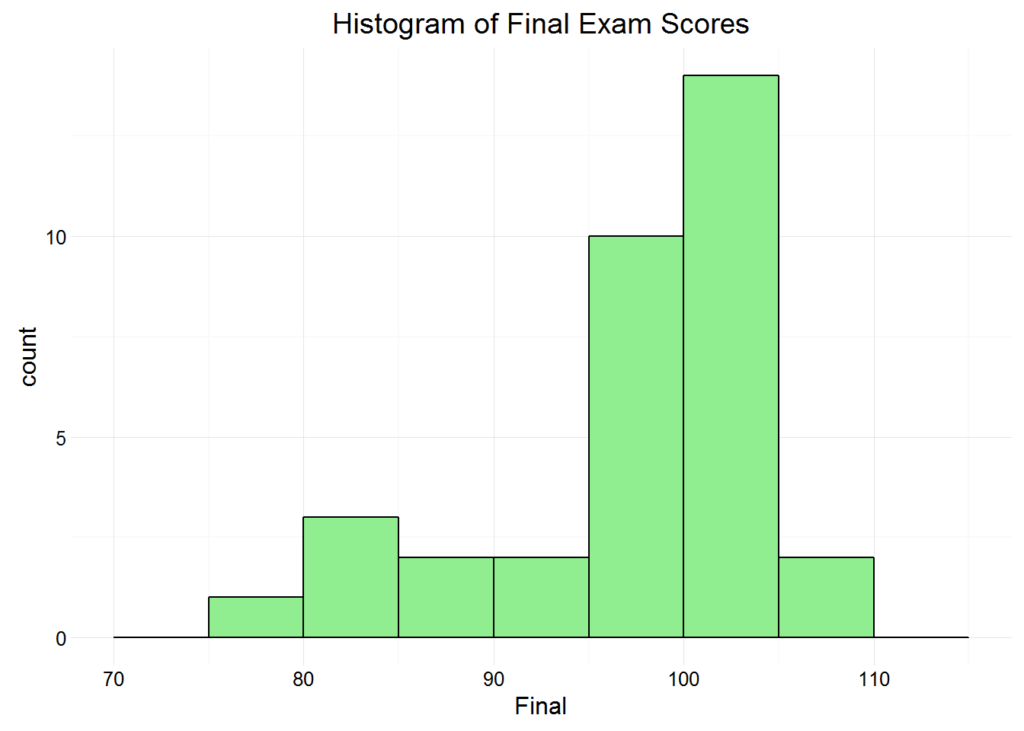
There is nothing overly troubling about the shape of this distribution. It is a loosely normal and a tad left-skewed, and we might question the distribution’s center, but the deviation in scores is about what we would expect. Furthermore, if you consider the course’s online, AP context, the concentration of high scores is less surprising. Online AP courses probably attract higher achieving students.
A standalone histogram is of limited use when studying gradebooks, and retyping or copying the code for each exam, quiz or assignment would take forever. Suppose, for example, we want to compare the distributions from multiple assignments, such as all quizzes or homework. To do so, we can create a facet grid with + facet_wrap(~Item).
Now let’s plot the histogram facet grid using only the quizzes from Unit 3:
plot_data <- apcalcbc %>%
filter(Type == “Quiz”,
Unit == “Unit 3”,
Score > 0)
ggplot(plot_data,
aes(Score)) +
geom_histogram(binwidth = 2, fill = “lightgreen”, color = “black”) +
ggtitle(“Unit 3 Quiz Scores”) +
facet_wrap(~Item) +
theme_minimal()
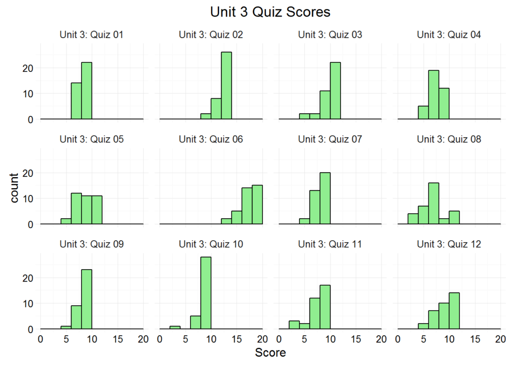
Here it might be worth nothing that the center of Unit 3: Quiz 06 is different from the other quizzes, but that could be due to a simple change in maximum score. We could have plotted a histogram for every quiz by removing the Unit == “Unit 3” argument, but that would have flooded our plot viewer with dozens of tiny, illegible plots. Filtering by Unit is preferable in this respect.
So now we’re interested in the quiz and homework distributions from other units, but there’s a problem: the thought of copying and pasting the same plot code and changing some filters and plot titles along the way is repellant. The process is not only cumbersome and time-consuming, but it lacks panache — an unspoken, essential quality of all data analysis. Fortunately, we can save a great deal of time and typing by creating our own custom function that plots our desired histograms with minimal effort.
User-defined functions are one of R’s signature advantages. The rule of thumb is that if you find yourself copying and pasting your code more than once, you should create your own function.
Our new function, gradebook_histograms(), will have three arguments: the tidy dataset, the gradebook type and a specified unit. The function will then use those three inputs to create a facet grid with the desired histograms that includes a red line marking the distribution’s median:
gradebook_histograms <- function(tidy_gradebook, type, unit) {
plot_data <- tidy_gradebook %>%
filter(Score > 0,
Type == type, #Filter by type input
Unit == unit) %>% #Filter by unit input
group_by(Item) %>%
summarize(Median = median(Score)) %>% #Calculate median score
left_join(tidy_gradebook, by = “Item”) #Join the summarized, grouped medians back onto the dataset
print(
ggplot(plot_data, aes(Score)) +
geom_histogram(binwidth = 2, fill = “lightgreen”/span>, color = “black”/span>) +
geom_vline(data = plot_data, aes(xintercept = Median), #Plot the vertical red line
color = “red”, linetype = “dashed”) + #Optional aesthetic arguments
facet_wrap(~Item) +
labs(x = paste(type, “Score”), y = “Count”) + #Axes labels determined by function input
ggtitle(paste(unit, type, “Scores”)) +
theme_minimal()
)
}
Now we tell R: “Show us the AP Calculus BC score distributions for all quizzes in Unit 1:”
gradebook_histograms(apcalcbc, “Quiz”, “Unit 1”)
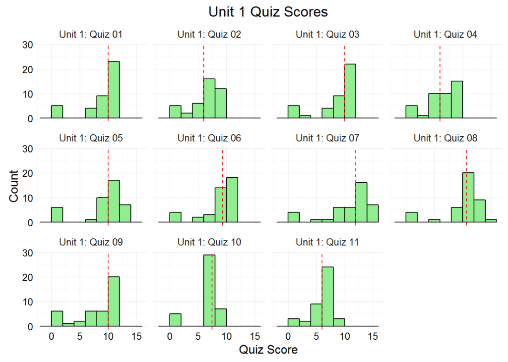
Voila! Thanks to our new function, the line between man and machine has been further blurred. If we want to view the distributions of homework scores or quiz scores from another unit or even another gradebook, we just have to change a few arguments. And if we know in advance that we want to see all the quiz plots for each unit anyway, we can call gradebook_histograms() iteratively within a for-loop. We won’t run the following code, but it creates the histograms for every quiz from each Unit:
for (unit in unique(apcalcbc$Unit)) { #This specifies four iterations, one for each unit
gradebook_histograms(apcalcbc, “Quiz”, unit)
}
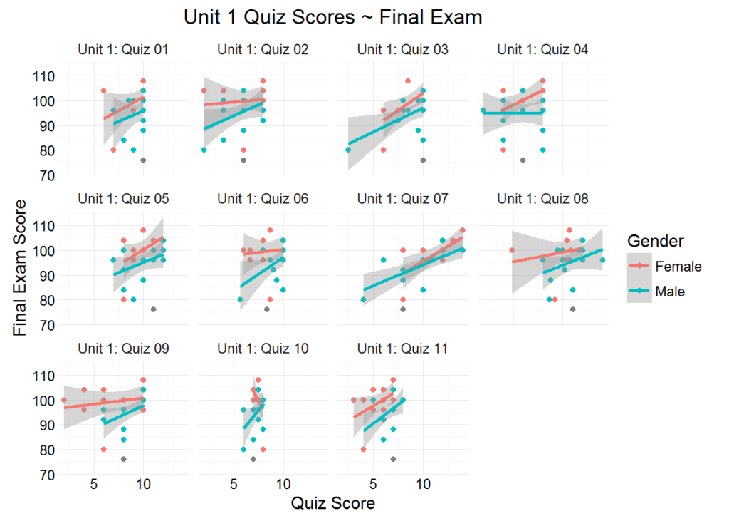
Scatter Plots with Two Continuous Variables
A curricular review is a Gordian knot of students and scores, teachers and technology, but another promising entry point is to consider how individual gradebook items relate to summative assessments such as a final exam. Correlation is not causation, but a series of scatter plots can flag potential issues and act as a springboard into other inquiries. An activity with little to no relationship to final exam performance is perhaps cause for concern.
Let’s create another function called gradebook_scatter_plots() that plots each student’s Item score on the x-axis, and their Final score on the y-axis. We’ll also add a smoother line with geom_smooth(method = “lm”) that captures the line of best fit for each plot. For additional customization, we’ll pass an elipses (…) into the function that provides room for additional, optional arguments. For example, if I want the color of the scatter plot points to identify each student’s gender, I can add color = “Gender” to my call of gradebook_scatter_plots(). And if I want the shape of the scatter plot points to identify each student’s ethnicity, I can add shape = “Ethnicity”. Here we create the function using the geom geom_point():
gradebook_scatter_plots <- function(tidy_gradebook, type, unit, …) {
plot_data <- tidy_gradebook %>%
filter(Type == type,
Unit == unit,
Score > 0,
Final > 0)
print(
ggplot(plot_data, aes_string(“Score”, “Final”, …)) + #The ellipses go where additional arguments are provided
#Because an additional mapping can be provided, we use aes_string()
geom_point() +
facet_wrap(~Item) +
geom_smooth(method = “lm”) + #Specifies line of best fit with shaded area representing 95% confidence interval
labs(y = “Final Exam Score”, x = paste(type, “Score”)) +
ggtitle(paste(unit, type, “Scores ~ Final Exam”)) +
theme_minimal()
)
}
With our new function, let’s view the scatter plots for all quizzes in Unit 1:
gradebook_scatter_plots(apcalcbc, “Quiz”, “Unit 1”)
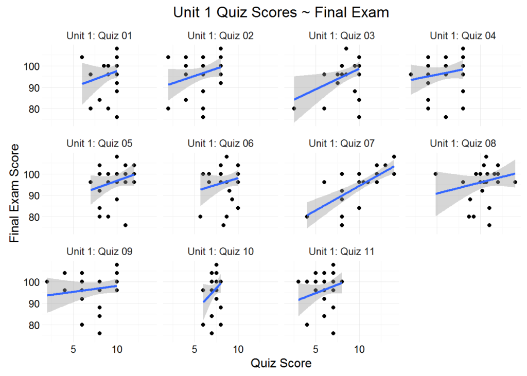
We observe a consistent positive relationship between quiz scores and final exam scores. The assumption here is that there is at least some overlap in the skills and knowledge required to succeed on the quizzes, and the skills and knowledge required to succeed on the final exam. An assignment that showed little to no positive correlation would raise some eyebrows, as would a concentration of points located outside the shaded confidence intervals. Here the relatively small sample size and the small variation in quiz score probably explains the phenomenon, but these are oddities worth investigating, and the purpose of the plots (along with the rest of our exploratory data analysis) is to flag potential issues within the curriculum. The scatter plots accomplish precisely this with remarkable speed and ease.
Let’s pass an additional argument to our function (color = “Gender”) and view the plots with the color of each point identifying each student’s Gender:
gradebook_scatter_plots(apcalcbc, “Quiz”, “Unit 1”, color = “Gender”)
Again, the sample size is too small to make any generalization about gender performance. What is important to see here is the process and method of viewing your data across multiple variables, some continuous, some categorical.
Comparing Distributions across Categorical Variables with Box Plots
A box plot is another useful visual aid when comparing distributions of a continuous variable across levels (groups) of a categorical variable. We can, for example, compare each ethnic group’s overall performance at a glance with geom_boxplot(). Here we’ll also calculate the class median and overlay the plot with a dashed red line indicating the value.
plot_data <- apcalcbc %>%
filter(Final > 0) %>%
distinct(Student)
class_median <- median(plot_data$Grade)
ggplot(plot_data,
aes(Ethnicity, Grade, fill = Ethnicity)) +
geom_boxplot(outlier.colour = “red”, outlier.shape = 1) + #Specifies color and shape of outliers
stat_summary(fun.y = mean, geom = “point”, shape = 23, size = 3) + #Plots the mean, indicated by diamonds on the plots
geom_hline(yintercept = class_median, color = “red”, linetype = “dashed”)
theme_minimal() +
theme(axis.text.x = element_text(angle = 45, hjust = 1, size = 10)) #Optional adjustment to labels
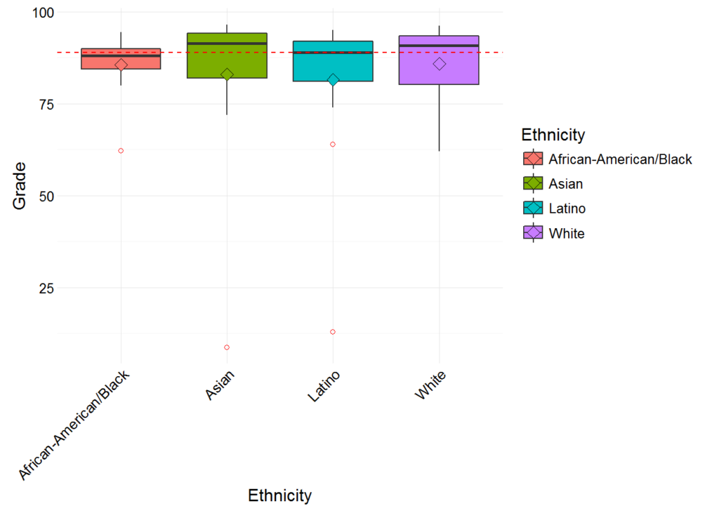
Of note: the median score for each ethnic group is comfortably close to the overall class median (indicated by the dashed red line), although some are higher than others. And if you’re curious, outliers in geom_boxplot() are points beyond 1.5 * IQR (inter-quartile range) in either direction.
Other Plotting Options
Far be it from me to drone through this entire post without mentioning some of R’s more dynamic graphing capabilities. Packages like googleVis, rCharts, and plotly allow you to create interactive visualizations, but many users still get usage out of base R and lattice. Perhaps the most exciting recent development in R plotting is the gganimate package which can “gif-afy” your plots into slick animations. In short, in the world of open source data visualization, R is probably king.
Have a question about R or this tutorial? Feel free to email me at [email protected].
![]()
About the Author
David wrangles, slices and dices data for Scout, but he also likes to pal around with the English department reciting Julius Caesar, extolling the innumerable merits of East of Eden, and arguing about the hegemonic canon.
About Scout
Learning is synonymous with empowerment at Scout. We are teachers, instructional designers and technologists working to deliver University of California-quality interactive online classes, curriculum and supplemental education materials to middle school and high school students and teachers across the U.S. and beyond. Our course materials are designed to inspire life-long curiosity and prepare pupils of all backgrounds and education levels for an increasingly technological world where training and job skills are mobile, asynchronous and self-directed. Explicitly created to bridge achievement gaps, we believe that using technology effectively can remove traditional obstacles to education.
