Written by:
Diane Mayse, Ph.D.
Data Manager for Blended Learning Programs
Connections Education
[email protected]
Brian Reed
Business Intelligence Developer
Connections Education
Remember when the advent of technology in education meant we were going to have better access to more data sets that were going to make our lives as teachers and school leaders easier and more effective? As the data manager for an educational management company that supports several blended high schools across the Midwest, I can tell you that the data sets are there in your student information and learning management systems, but they are often organized in different formats to meet a variety of corporate, state reporting, teacher, and school leader needs. These individual and varied reports could all benefit from some help with interpretation and analysis in order to get the collaborative insights that we need to do our jobs more effectively.
Over the past two years, I have been on a mission to improve the data and reporting efficacy by streamlining and simplifying the data in these types of reports for the Nexus Academy blended high schools supported by Connections Education. I have been working in collaboration with our business intelligence team to make data reports more visual and transform them from point-in-time data to performance-over-time data sets, working with all levels of school teams to ensure that everyone using the reports understands the data they are working with. I then build skills in using the data to create and monitor school improvement and professional learning community (PLC) goals. I am happy to report that as a result of our collaborative team effort to better understand and use data, the blended high schools have seen increases in teacher and school leader confidence in using data effectively and strategically for their needs, as well as increases in course passing rates and school improvement goal achievement. I am excited to share with you the simple steps we have used to achieve success.
Simplifying and Streamlining the Data and Delivering It Directly to Users
One of the most important preliminary steps was to create a custom report that included all of the datasets that would be used to review and track school and student performance throughout the school year. We included student course performance data (course name, course grade, course completion progress), teachers and success coaches (mentors), various student demographic data, and intervention data to help monitor students who were receiving additional support. Next, we reviewed the data sets to determine if the correct data was included. The business intelligence developer reviewed the field names for the data included in the report, and he set up any calculated fields. Then, I confirmed that the data report included the key datasets the school leaders and administrative assistants needed for school performance monitoring and reporting and what the teachers and success coaches (mentors) needed for student performance monitoring. All of this data was then placed into a single Excel-based report.
Our next task was to launch the completed report and help everyone understand how to use it effectively to monitor student performance. I attended school-wide and PLC meetings and met with school team members one-on-one to provide mini-lessons on sorting and creating pivot tables and using some of the Excel functions so that all levels of school teams understood how to find the data that they needed in this one report. I also realized that having everyone use the same report for performance monitoring reduced the confusion from pulling various reports and occasionally finding data points that didn’t match. For example, prior to creating the custom report, we found that one report was rounding student grades to the hundredths decimal and another report was rounding student grades to the tenths decimal. This resulted in some confusion when one letter grade was calculated for a course (on report “A”) and another letter grade was calculated for that same course (on report “B”). The same course was reported as having two different letter grades — all due to different built-in rounding metrics that calculated the letter grade. With our custom report we were able to resolve these types of discrepancies that can cause frustration for users who don’t have a lot of experience with data-based reporting tools. We connected teachers with the business intelligence programmers to solve issues like this one and strengthen the understanding that each group has of the work done by their partner group.
Another feature built into the reporting process was a set of custom reports provided to each teacher, success coach (mentor), and school leader on Mondays and Fridays. We got feedback from our data users that it was helpful to have the data come to them instead of them having to “find and then download it.” After monitoring the custom report process for two semesters and tweaking some of the data pieces in it, I estimate that it met 80%-85% of the prior year’s requests (of me) for data and performance monitoring needs for the school teams as well as many of the metrics needed for various reports that principals completed throughout the year. This saved a great deal of time that had been spent looking for reports and then looking for data within those reports. Examples of datasets that weren’t in this report include attendance data and stages-of-enrollment data, which usually have a summary component as well as a more detailed daily or weekly data component, and were better handled together in separate reports.
Collaborating With the Technology Reporting Team to Create Visual Reporting Tools
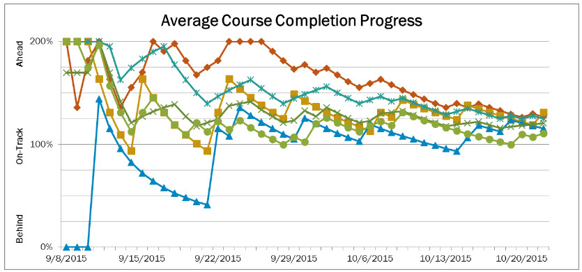
Among the challenges we continued to face was helping school team members get more comfortable with Excel-based data files and having to spend the time to construct pivot tables and configure sorting processes each time they wanted to compare student learning performance at various times during the semester. One of the success coaches (mentors) who had some experience with Excel began taking point-in-time data and building performance-over-time graphs in Excel for each student. He created a tab for each of his assigned students and built a graph of course grades and a graph of course completion progress from the data in the twice-weekly reports. He showed his graphs to me, and I saw the power of being able to watch grades increase, note the point in the courses where grades decreased, and use that information to determine if additional support may be needed. I reached out to our business intelligence team to see if these graphs could be built into the next school year’s set of reports. The team worked with the sample Excel data file that the success coach had given me and added an interactive tab (to the same report file that our school teams were already comfortable using) where the teacher could view student learning progress-over-time across courses at the course level as well as the progress of individual students within a course, and the success coach could view progress-over-time in all courses for each student. Below is a re-creation of a data set of one student’s first six weeks of school.
On the first graph, each of the student’s six assigned courses is represented as one line on the graph. Weekly report dates are displayed across the bottom, and course completion status is displayed on the left side (Behind, On-Track, Ahead). You can see that course completion started off very fast in some courses and very slow in others. You can see how the course completion progress became more consistent overall as the success coach worked with this student on managing the more self-directed learning process in the blended environment.
On the second graph, the same six courses are represented with the same lines. Weekly report dates are displayed across the bottom, and course grade percentages are displayed along the left side. You can see that the student’s grades ranged, at first, from failing to excelling as the student began working through courses and responding to graded assessments. As the teachers worked more with the student onsite and virtually, and with continued support from the success coach, you can see how the student became more skilled at learning course material. Within about four weeks, this student was passing all courses in a consistent manner.
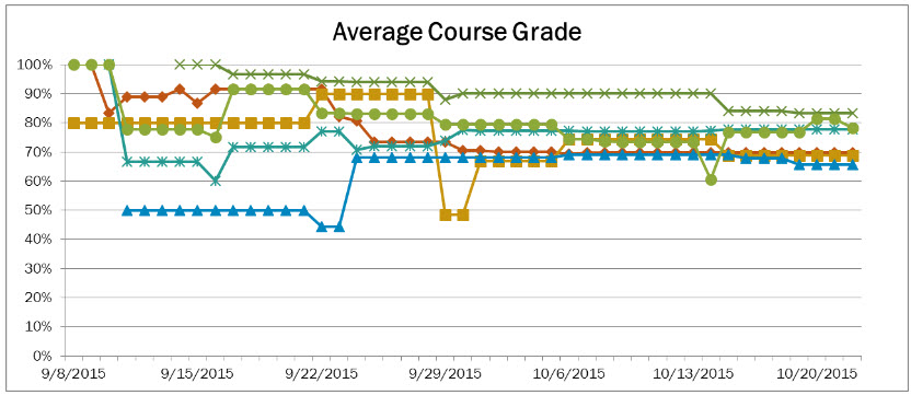
The combination of performance-over-time data and the visual reporting tool exponentially increased school teams’ ability to target student learning needs at key points throughout the semester; this led to further increases in course passing rates and school improvement goal achievement. Because the visual reporting tools could identify student learning trends by course and by teacher or success coach, it became a helpful tool for conversations between school leaders and their teacher teams throughout the school year and functioned as a component of the annual evaluation process as well.
Key Results
At the end of the 2015 Fall semester, I surveyed the estimated 94 report users and asked them to rate their skill level and comfort level with knowing where to find and how to use the data that they needed to be effective in their jobs, using a 1-to-5 scale such that a:
- “3” was consistent with knowing where to find and how to use the data they needed for their job,
- “4” was consistent with knowing where to find the data and use it in a more strategic way to target student learning needs, and
- “5” was consistent with having a comfort level of strategically using data to target learning needs as well as a comfort level with teaching others how to use the data strategically.
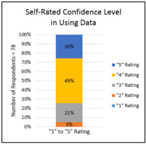
Survey results indicated that out of 84% of users who responded to the survey (N=78 respondents).
- 95% rated themselves at a “3” or higher and
- 75% rated their skill level as a “4” or “5.”
These results confirmed that we were on the right track.
After three consecutive semesters of focusing on effective data use and continuing to develop visual reporting tools for targeted learning support, we have seen increases in course passing rates for all credit earning courses as shown in the first chart (top) and increases in the percent of full academic year students earning a full year’s worth of credits (promoting to the next grade level and supporting four-year cohort on-time graduation rates) as shown in the second chart bottom) from 2014-15 to 2015-16:
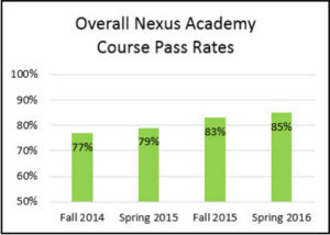
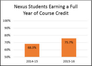
This is especially encouraging given that the student population across all Nexus Academy schools grew almost 20% during this same timeframe. The schools were getting better at improving student learning performance outcomes and effectively managing growth at the same time.
These learning and performance outcomes are not the result of just implementing a new reporting tool, however, as school improvement is always a collaboration of many effective practices aligning to support student learning. We believe in the iterative process of working with our school-based data users to understand their data needs, design a solution, and ensure that users know how to use the data reporting solution. We do this by offering training sessions and by modeling the use of data reporting tools at school-wide data and PLC meetings. We continue to build on this foundation of helping all levels of school teams by engaging in meaningful conversations about data to support schools so that they achieve their goal of offering a myriad of initiatives to positively impact student learning achievement.
This fall we are excited to begin the transformation of our data management system to more of a knowledge management system as we migrate the various data sets to the Microsoft Power BI software, an online tool focused on interactive visualizations of data and is supporting our efforts to begin building interactive data dashboards for the school teams. These dashboards will combine the benefit of learning performance trends-over-time data with interactive “point and click” subgroup analysis for all levels of school team members through permissioned access that is built into the program. Over time, the learning we hope to get from these performance-over-time data sets is the ability to early identify at-risk learners so that the schools can provide targeted support. Along with the launch of these new tools, we will revisit school-wide meetings and again offer to meet with teams in PLC meetings and small groups to ensure that they become comfortable using these new tools.
In summary, data and reporting efficacy begins with auditing the data and reporting systems your school is currently using to ensure that you are putting the most important data in front of your users in a timely manner. Confirm that your users know how to use the data effectively by joining already established meetings and doing “mini” data and reporting trainings to help build skills in looking at data points and trends and understanding how to use the data to set and monitor school improvement goals and target individual student learning needs. Continue to improve the data and reporting capabilities by collaborating with your internal technology departments to see what tools they have available to help make your data more visual for your users. If you don’t have an internal reporting or technology team, contact your Learning Management System (LMS) provider to see what options they can create for you. Consider attending webinars or looking into Lynda.com training opportunities to find out what might be possible to extend the reach of your current data reporting system. If you have access to a local university, they may have someone who can help you look at options and may have someone who does community outreach who can help you design something. Talk with your data and reporting users throughout the year to see what their data needs are and if your tools or processes need updates. If you are able, survey your user groups to see how they perceive their own competence with using the data tools available to them. Finally, look at the student learning performance outcome data to see where there are opportunities to celebrate improvement and look for further opportunities to improve the next year. Data reporting and data analysis provide great opportunities to increase communication with your school team customers and build strong working relationships that result in positive student learning outcomes for your students.
